This will be a three part series on skinning Flex components. For part one I have chosen to desolve the myth that Flex 3 can’t truly cascade styles. This three part series will start simple and get more complex with each post. You can use this code to mimic descendant selectors, dimensioning and multiple class names within Flex.
Problem:
Flex can’t do true cascading styles like HTML (for example a black play button)
Solution:
YES, flex can do cascading styles. It just requires a different approach. A programmatic approach. Don’t worry, I assure you that even a non-programmer can pick this one up.
Lets dive a little deeper. Cascading styles refers to the ability to start with a button, style it into a black button then go a step further and make it a play button. First, create a button and use some CSS to style various properties of that button.
<?xml version="1.0" encoding="utf-8"?>
<mx:Application xmlns:mx="http://www.adobe.com/2006/mxml" layout="absolute" xmlns:text="flash.text.*">
	<mx:Style source="css/styles.css" />

	<mx:Button label="Click Me"/>
</mx:Application>
Button {
	cornerRadius: 12;
	fontSize: 15;
}
Simple enough, right?
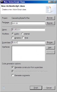
Next we want a black button:
package com.cb
{
	import mx.controls.Button;

	public class BlackButton extends Button
	{
		public function BlackButton()
		{
			super();
		}
	}
}
There it is. All the actionscript you will need. And to think it was all auto generated!
Add the MXML and CSS:
...
<button:BlackButton label="Click Me" />
...
BlackButton {
	fillAlphas: 1.0, 1.0;
	fillColors: #000000, #000000;
	color: #FFFFFF;
}
Now we have a black button. This process can be used as many times as you want to continually inherit properties from another object. You could have a small, blue button with red text all styled at each level.
Lastly, we need to add the play icon:
...
<button:BlackButton label="Click Me" styleName="playButton" />
...
.playButton {
	 icon: Embed(source='assets/play.png');
}
Now we have a black play button. Add a stop, pause, and mute button as BlackButton’s and they will all be updated when you modify the style for either the base Button class or the BlackButton class. Again, this tutorial is not very technical but the next two will be. This is meant to be the first step in bridging the gap between design and actionscript using Flex 3.
The number of comments I get on this post will exponentially increase the likelihood of part 2 coming out sooner 
References:
CSS in Flex is not real CSS at all

This is a fantastic post. Thanks Chris! I am looking forward for the next one.
I’m excited for Flex 4 which supports descendant operators like full CSS does. This will not only allow a button to get styles from Button and BlackButton, but will also allow the button to get different styles when it is in a Panel or a Canvas.
Canvas BlackButton {
… some custom styles here
}
Panel BlackButton {
… different styling treatment here
}
That will really help with skinning because then you can tell the buttons in a scrollbar to look different from the buttons in a form.
You could create a CanvasBlackButton class and PanelBlackButton class that both extend BlackButton. Which would make your CSS look like this:
CanvasBlackButton {
… some custom styles here
}
PanelBlackButton {
… different styling treatment here
}
This would allow you to style your buttons differently but both inherit from the styles of BlackButton. I agree though, it will be nice when full descendant support is included in Flex CSS.
Thank you so much I can’t wait to experiment with styling other components with your method.
Great tutorial!
thanks great tutorial, I found this another tutorial about skinning using swf files. might be useful to others:
http://www.askmeflash.com/tutorial/4/skinning-a-flex-button-tutorial-using-skin-in-flex